Position Charts
The Position Chart component is available in the XTrader module within your XCore Portal and can be used for internal as well as external purposes, notably when it comes to checking out the main indicators of current aggregating positions of the account. This component is demonstrated below.
In this case, the position exposure is demonstrated as a pie percentage:
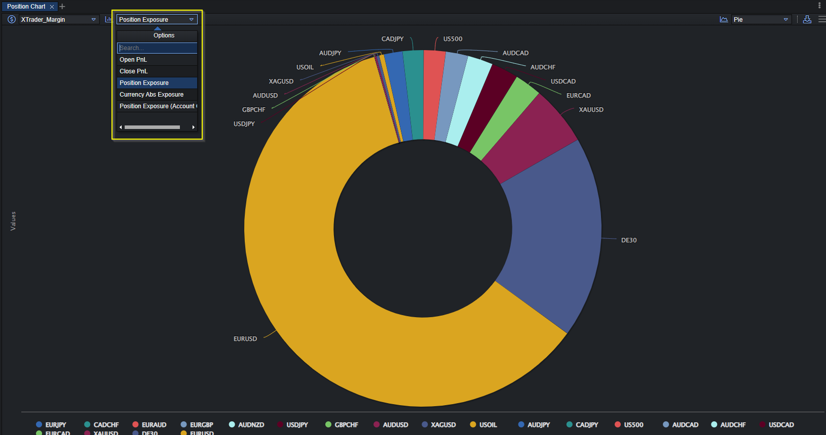
There is the position exposure drop-down menu in the top-right corner of the tab. The following indicators are listed there:
- Open PnL – Profits and losses. This indicator is equal to the sum of all the open positions.
- Close PnL – Profits and losses on closed positions where the PnL was not yet calculated in the Account balance.
- Sum Closed PnL – The Sum of profits and losses on closed positions where the PnL was not yet calculated in the Account balance. The available timeframes are: daily, weekly, monthly.
- Position Exposure – The amount of possible risk at any given point due to market movement by holding a position.
- Position Exposure (Account Ccy) – The amount of possible risk at any given point due to market movement by holding a position displayed in the account’s currency.
- Currency Abs Exposure – The absolute account currency exposure of each currency.
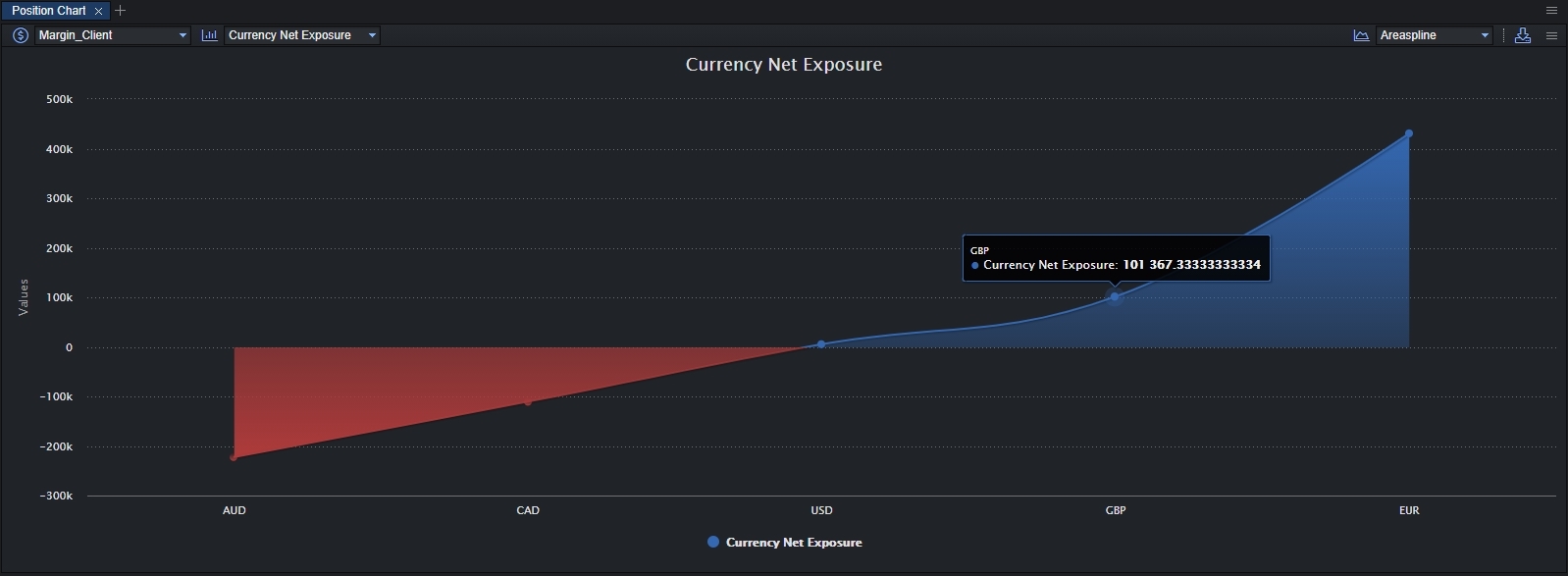
- Currency Net Exposure – The net account currency exposure of each currency.
In the top-right corner, the formula of the chart (type of the chart) has to be selected, as it is demonstrated below:
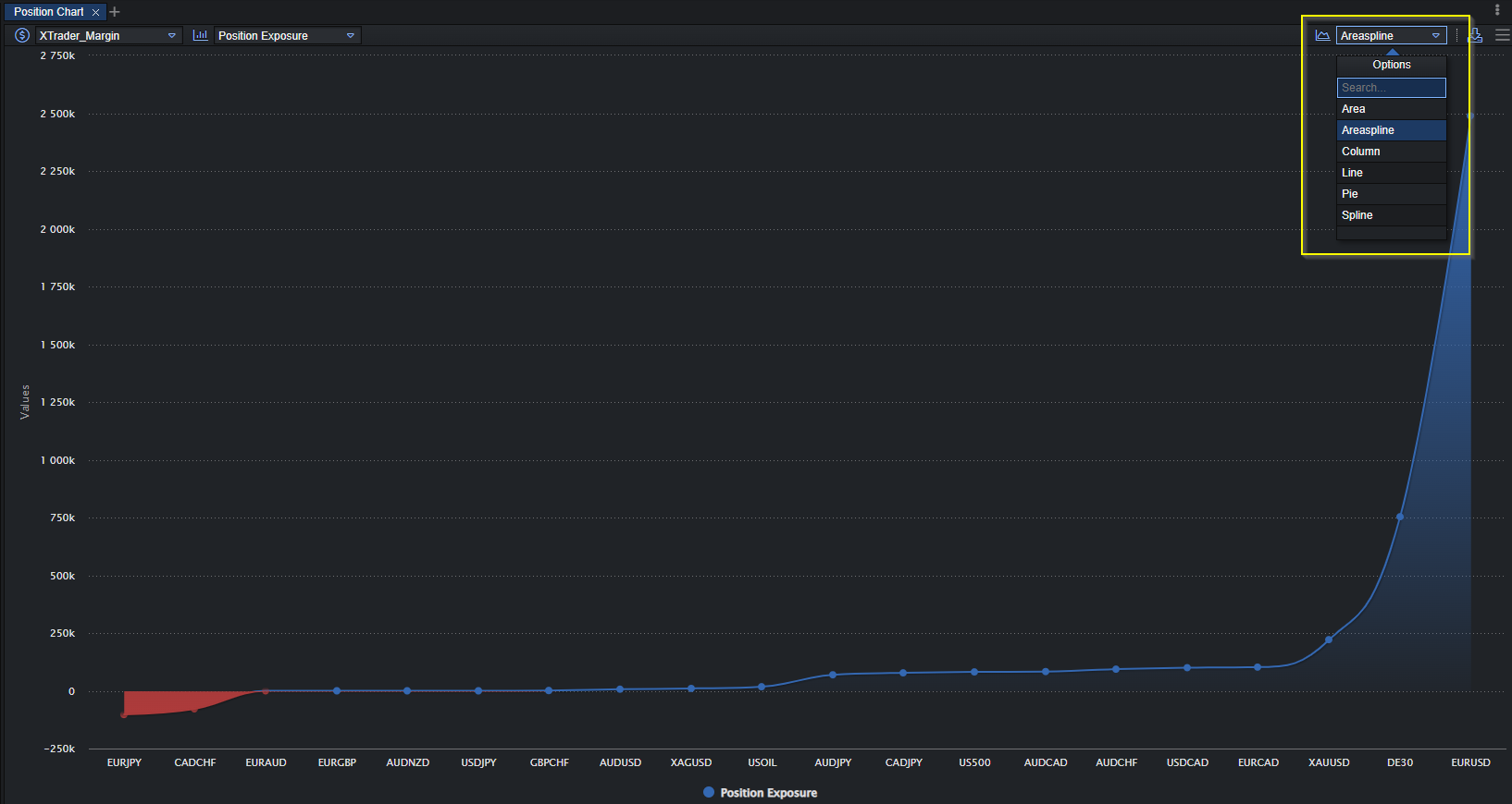
The following types of the chart are available:
- Line – displays information as a series of data points called “markers” connected by straight line segments. It is a basic type of chart.
- Area – displays graphically quantitative data. It is based on the line chart.
- Areaspline – is the same as the area chart, only the line is a spline instead of being straight.
- Spline – it is a line chart in which data points are connected by smooth curves: this modification is aimed to improve the design of a chart.
- Column – it is a data visualization where each category is represented by a rectangle, with the height of the rectangle is proportional to the values being plotted.
-
Pie – it is a circular statistical chart, which is divided into slices to illustrate numerical proportions.
-
e.g. here is the areaspline of Currency Net Exposure: